
During the last weeks we have visited many websites with different user interface design patterns with the peer researchers of PIKSL. This week the peer researchers of Proqualis have started their first tests.
The peer researchers have visited many well-known websites. Some of the websites were easy to navigate and the used patterns were known by the testers. Other websites were more difficult to use. For example, one of the questions that arose was “What is a hamburger menu?”.
In the next weeks our Proqualis peer researchers are going to continue testing. We are looking forward to the results.
Here you can read how the User Interface Pattern tests went at PIKSL.
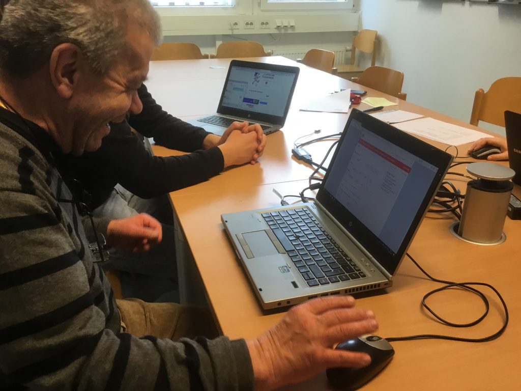
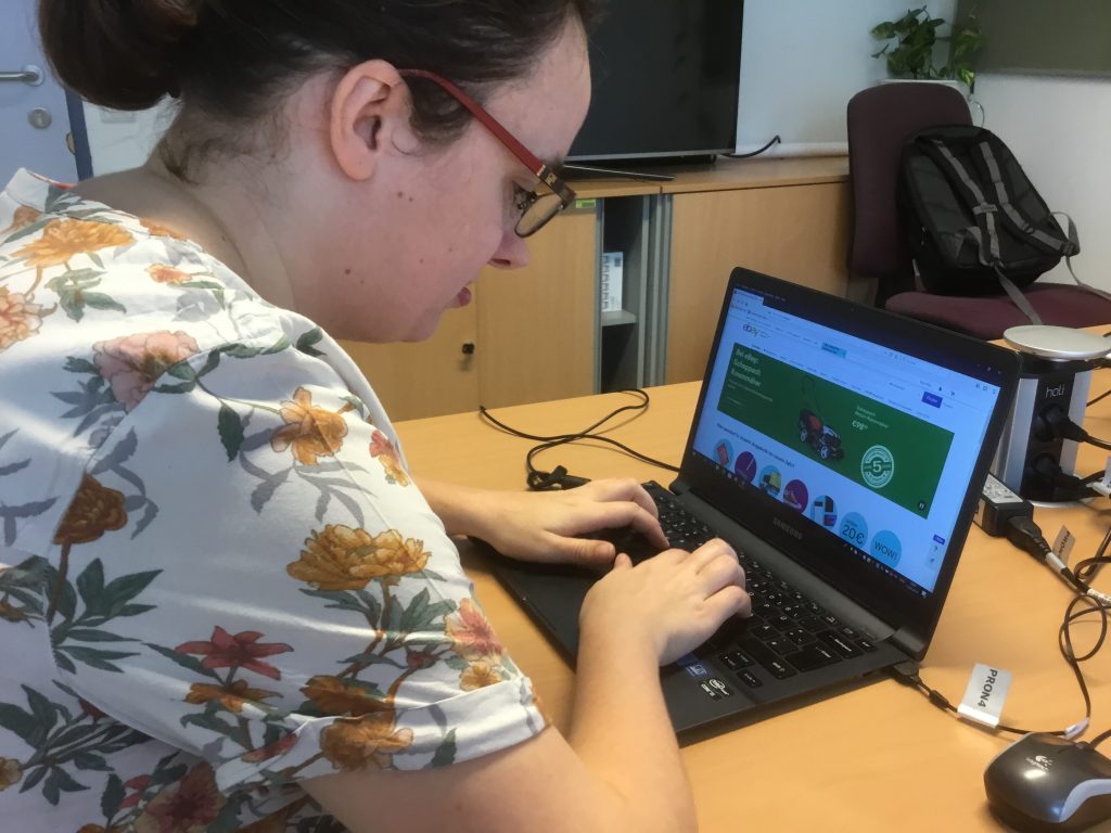
Pictures of the Peer-Researchers during testing websites.
What are User Interface Design Patterns?
In order to be able to quickly grasp our environment, human perception is trained to recognize meaningful patterns.
This also applies to the use of websites. Many user interfaces of websites have a similar structure. They have similar patterns. As we frequently visit websites, we remember how a typical website is structured and which elements provide which functions.
This is helpful because it allows us to quickly navigate a website and to find information.
An example of a pattern are hamburger menus.
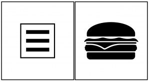
A hamburger menu is a symbol (icon) with three horizontal lines (see picture above). If you click on the icon, the menu of the website is opened. This can only work if the users know which function the Hamburg menu has. Many users have learned that a click on the Hamburg menu displays the menu of a website. The pattern is saved in their head and is called up automatically. But not all users know the function of the Hamburg menu.
Comments are closed, but trackbacks and pingbacks are open.